rtweet
I was inspired by David Robinson’s Tidy Tuesday screencast to work with rtweet on familiar Twitter handles. Writing on rtweet is an amusing bit of productive procrastination while honing my R skills.
The rtweet package creator and owner, Mike Kearney, has hosted data journalism workshops covering a wide range of uses for this kind of data. They include text sentiment, geospatial networks, time series, and even bot detection. Oscar Baruffa and Veerle van Son have written a bookdown pamphlet called Twitter for R Programmers as a starter guide for people new to the R community on Twitter. Colin Fay has a nice blog post on his exploration with the {rtweet} package. And on his #30daysmapchallenge, David Hood put together a super non-geographic map at A map of my Twitter readers.
In this post we will look at the accounts that I engage most often, explore the time of day for my Twitter activity, probe for the presence of bots, and close by building an affinity map visualization of my Twitter network following.
As with any other project, start with loading the appropriate libraries.
knitr::opts_chunk$set(
  echo = TRUE,
  message = FALSE,
  warning = FALSE,
  fig.height = 7.402,
    fig.width = 12,
  fig.align = "center"
)

suppressPackageStartupMessages({

library(tidyverse)   ## tidy data manipulation, including dplyr and ggplot
library(rtweet)     # the R Twitter API
library(tweetbotornot)  #ML to classify Twitter accounts as bots or not bots.
library(lubridate)  # date manipulation tools
library(reactable)   # A Formatted Sortable Interactive Table
library(ggrepel) # adding labels that don't overlap
library(hexbin) # used for map background
library(umap) # umap dimension reduction
library(here) # helper for directory locations
})
extrafont::loadfonts(quiet = TRUE)

theme_set(hrbrthemes::theme_ft_rc() +
            theme(plot.title.position = "plot"))

pal <- wesanderson::wes_palette("Zissou1", 21, type = "continuous")
The rtweet Obtaining and using access tokens vignette provides instructions for creating API tokens and writing them to a location on .Renviron. This only needs to be done one time.
Let’s have a look at the accounts that I favorite (or like) the most:
# there is a rate limit at Twitter at approximately 18000 each 15 minutes
df_likes <- rtweet::get_favorites("jim_gruman", n = 3000)
users_favorite <- df_likes %>%
group_by(screen_name, user_id) %>%
summarise(
quant_fav = n(), .groups = "drop"
) %>%
arrange(desc(quant_fav))
users_favorite %>%
slice_max(n = 15, order_by = quant_fav) %>%
mutate(screen_name = reorder(screen_name,quant_fav)) %>%
ggplot(aes(y = screen_name, x = quant_fav, fill = quant_fav)) +
geom_col(show.legend = FALSE) +
theme(text = element_text(hrbrthemes::font_rc, size = 16)) +
labs(
title = "The 15 Twitter accounts I 'like' the most often",
subtitle = paste0("Within the past 3000 Tweets, since ",min(as_date(df_likes$created_at, tz = "America/Chicago"))),
y = "@ user names",
x = "# of tweets liked",
caption = paste0(format(Sys.Date(), "%b %d, %Y"), "| @jim_gruman")) +
scale_fill_gradientn(colors = pal,
aesthetics = c("color","fill"),
limits = c(10,48))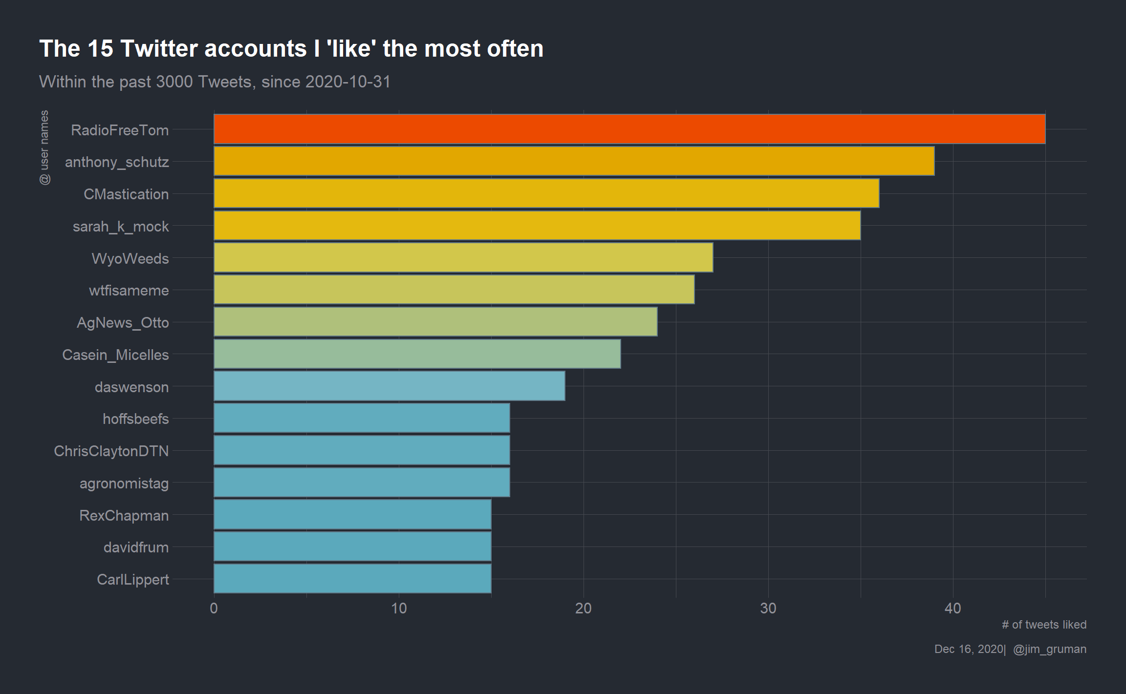
And let’s break down my activity by week day
tw_activity <- df_likes %>%
    transmute(
              tw_hour = hour(as_datetime(created_at, tz = "America/Chicago")),
              tw_day = as_date(created_at, tz = "America/Chicago"),
              tw_weekday = wday(tw_day,label = T, abbr = T, week_start = 1)
    ) %>%
    group_by(tw_weekday, tw_hour) %>%
    summarise(
        quant_fav = n(), .groups = "drop",
    ) %>%
    group_by(tw_weekday) %>%
    mutate(prop = quant_fav / sum(quant_fav)) %>%
    ungroup()

tw_activity %>%
    ggplot(aes(x = tw_hour, y = prop, fill = prop)) +
    geom_col(position = position_nudge(x = .5),
             show.legend = FALSE) +
    scale_x_continuous(breaks = c(6, 12, 18)) +
    hrbrthemes::scale_y_percent() +
    facet_wrap(~tw_weekday, ncol = 5) +
    theme(text = element_text(hrbrthemes::font_rc, size = 16),
    panel.grid.minor = element_blank(),
    plot.margin = margin(0.25,0.5,0.25,0.5,"in")
      ) +
    labs(
        title = "My recent `liking` activity on Twitter",
        subtitle = paste0("Within the past 3000 Tweets, since ",min(as.Date(df_likes$created_at, tz = "America/Chicago"))),
        x = "hour of the day",
        y = "",
        caption = paste0(format(Sys.Date(), "%b %d, %Y"), "|  @jim_gruman")) +
  scale_fill_gradientn(colors = pal,
                       aesthetics = c("color","fill"),
                       limits = c(0.01,0.10))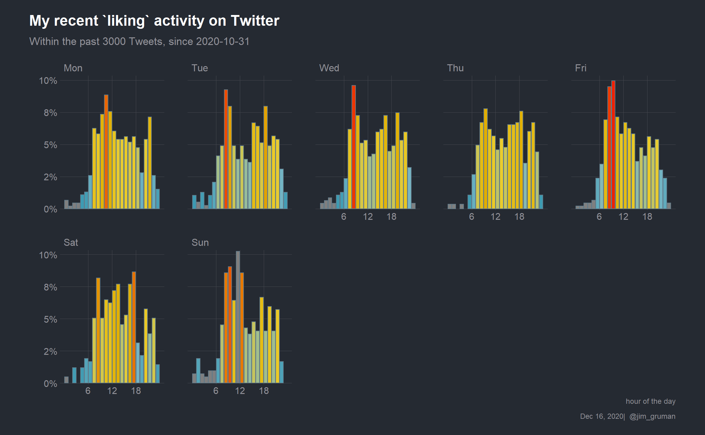
To build the map characterizing my social media reach, let’s start by gathering my followers and their details into a dataframe:
tn <- get_followers("jim_gruman") # get my followers
usrs <- lookup_users(tn$user_id) # get my followers full details
Twitter makes a distinction between followers and friends. My followers are accounts that choose to follow my tag, @jim_gruman, and see my activity in their news feed (unless muted). At present, it is a list of 2245 user IDs, or “handles.” To capture more information on my followers, my list must be fed into lookup_users().
We will parse my followers list down somewhat by choosing for accounts in the top 90% of the distribution of counts of both followers and friends. We will also limit the list to those that have posted a tweet, retweet, or favorite at some point in time during the year 2020.
top_usrs <- usrs %>%
  filter(followers_count >
           quantile(usrs$followers_count,
                    probs = 0.1, na.rm = TRUE),
         friends_count >
           quantile(usrs$friends_count,
                    probs = 0.1, na.rm = TRUE),
         as_date(created_at) > dmy("01-01-2020"))

rm(usrs)
The list drops to 1752 handles to study. My followers in total have 6320554 followers, though the actual number of distinct handles will be less because of overlap. On the surface, this appears to be a reasonably sized challenge.
Let’s pause here and take another look at this listing. I am also interested in how many of my followers have chosen bot accounts as friends. Michael Kearney’s tweetbotornot offers a single function for ascertaining probabilities. The default gradient boosted model uses both users-level (bio, location, number of followers and friends, etc.) and tweets-level (number of hashtags, mentions, capital letters, etc. in a user’s most recent 100 tweets) data to estimate the probability that users are bots. For larger data sets, the method can be slow. Due to Twitter’s REST API rate limits, users are limited to only 180 estimates per every 15 minutes.
To maximize the number of estimates per 15 minutes (at the cost of being less accurate), we apply the fast = TRUE argument. This method uses only users-level data, which increases the maximum number of estimates per 15 minutes to 90,000, but the accuracy is diminished.
bots <- tweetbotornot(top_usrs, fast = TRUE) %>%
  arrange(desc(prob_bot))
if (file.exists(here("content/post/rtweet-on-windows/bots.rds"))) {
bots <- read_rds(here("content/post/rtweet-on-windows/bots.rds"))
} else {
bots <- tweetbotornot(top_usrs, fast = TRUE) %>%
arrange(desc(prob_bot))
write_rds(bots, file = here("content/post/rtweet-on-windows/bots.rds"))
}bots %>%
filter(prob_bot > 0.9) %>%
select(screen_name, prob_bot) %>%
knitr::kable(caption = "Likely BOTS that my followers have friended.") %>%
kableExtra::scroll_box(width = "100%", height = "400px")| screen_name | prob_bot |
|---|---|
| AgLendingGroup | 0.9953 |
| DataScienceInR | 0.9917 |
| Action6thDistIL | 0.9907 |
| JoannaLidback | 0.9901 |
| AcrossSpectrum | 0.9885 |
| danrejto | 0.9871 |
| bikelaneuprise | 0.9867 |
| ethancleary | 0.9858 |
| blackcow02 | 0.9854 |
| CherylBozarth | 0.9839 |
| Ambient_Intel | 0.9838 |
| DataCornering | 0.9836 |
| maytownsend | 0.9827 |
| fast_crystal | 0.9814 |
| dorfman_baruch | 0.9810 |
| UnderstandingAg | 0.9809 |
| edotosetti | 0.9793 |
| SabantoAg | 0.9783 |
| CultivationCorr | 0.9769 |
| edschober | 0.9763 |
| JonEntine | 0.9758 |
| Satrdays_DC | 0.9758 |
| ComClassic | 0.9740 |
| crcgrubbsd | 0.9730 |
| StopSterigenics | 0.9723 |
| TheRealOG_Dreah | 0.9720 |
| VirtualConfere2 | 0.9709 |
| ChaelMontgomery | 0.9667 |
| mikejgraham1 | 0.9660 |
| brettchase | 0.9660 |
| DeconinckKoen | 0.9653 |
| HouseAgDems | 0.9642 |
| TimeAgro | 0.9628 |
| Storm5farms | 0.9626 |
| AndyAtLogikk | 0.9608 |
| agbiotech | 0.9605 |
| TracySchlater | 0.9571 |
| soozed | 0.9571 |
| sustaincase | 0.9561 |
| agrivision_er | 0.9546 |
| zerohourclimate | 0.9527 |
| CattleTales | 0.9521 |
| JoniWallaceML | 0.9514 |
| DakotaStandard | 0.9507 |
| thalesians | 0.9507 |
| wagfarms | 0.9505 |
| sermowire | 0.9504 |
| iastatejay | 0.9489 |
| bwrasa | 0.9489 |
| OhioStatePA | 0.9486 |
| TiffDowell | 0.9485 |
| Superior_Silos | 0.9467 |
| FarmGirlJen | 0.9441 |
| cncfarms99 | 0.9438 |
| FarmOpCap | 0.9438 |
| paix120 | 0.9436 |
| hoffsbeefs | 0.9434 |
| dmwiebe | 0.9422 |
| racheldgantz | 0.9418 |
| MarketToMarket | 0.9387 |
| AgNews_Otto | 0.9378 |
| markbomford | 0.9376 |
| twitevit | 0.9367 |
| ChannelMktMC | 0.9355 |
| kansas_amy | 0.9347 |
| Rocks_Gone | 0.9332 |
| analytics_post | 0.9329 |
| Knuckey_Aus | 0.9327 |
| TerryDonahoe2 | 0.9321 |
| FutureOfAg | 0.9321 |
| Mattkohnen1 | 0.9320 |
| SchrimpfPaul | 0.9314 |
| TechHummingbird | 0.9301 |
| IHeartAwarenes1 | 0.9292 |
| WIAgLeader | 0.9288 |
| Dougwoolf | 0.9288 |
| iWorkMarket | 0.9277 |
| TheLANDonline | 0.9264 |
| StrathJim | 0.9258 |
| sustainablegreg | 0.9241 |
| johngaspard | 0.9222 |
| riviereagseeds | 0.9217 |
| BlakeEarly10 | 0.9196 |
| GMOInfo_IT | 0.9196 |
| shadesnatureinc | 0.9188 |
| tylerpaduraru | 0.9187 |
| RayLong | 0.9172 |
| prometheusgreen | 0.9147 |
| MatBonaventure | 0.9146 |
| _GypsyCouple | 0.9144 |
| mem_somerville | 0.9131 |
| IAwateralliance | 0.9131 |
| ChiNurse | 0.9126 |
| scherms93 | 0.9124 |
| messykennedy | 0.9120 |
| 2rkiva | 0.9118 |
| MarkLaVenia | 0.9108 |
| skyx_agri_swarm | 0.9092 |
| HayMapApp | 0.9092 |
| RhondaT40 | 0.9082 |
| HempDirectUSA | 0.9078 |
| SteveSprieser | 0.9069 |
| HJ_Thompson | 0.9063 |
| PerryComGroup | 0.9044 |
| IndivisibleNEIA | 0.9041 |
| OntFarmerNews | 0.9033 |
| fowlerfarms11 | 0.9031 |
| cmnicholson_ | 0.9017 |
| Emilycgb | 0.9016 |
| CowSpotComm | 0.9004 |
| Danialcrig1 | 0.9003 |
Let’s also re-create our version of Michael Kearney’s Polar plot with bots and my favorites accounts from above.
accounts <- c(pull(users_favorite, screen_name)[1:6],
              pull(bots[1:5,], screen_name),"rstats4ds")

tmls <- get_timelines(accounts, n = 3000)
tmls %>%
mutate(tw_spot = floor_date(as_datetime(created_at, tz = "America/Chicago"), "10 mins")) %>%
group_by(tw_hour = hour(tw_spot) + minute(tw_spot) / 60,
bots = if_else(screen_name %in% pull(bots[1:5,], screen_name), TRUE, FALSE),
screen_name) %>%
summarize(activity = log10(n()),
.groups = "drop") %>%
ggplot(aes(tw_hour, activity, color = bots)) +
geom_point(show.legend = FALSE) +
geom_polygon(show.legend = FALSE) +
theme(axis.text.y = element_blank()) +
coord_polar(theta = "x") +
facet_wrap(~ screen_name) +
labs(title = "Is it a TweetBot or Not?",
subtitle = "Tweet frequency by time of day, Chicago time, in 10 minute buckets for last 3000 Tweets",
y = "log(TweetCount)",
x = "Time of Day") 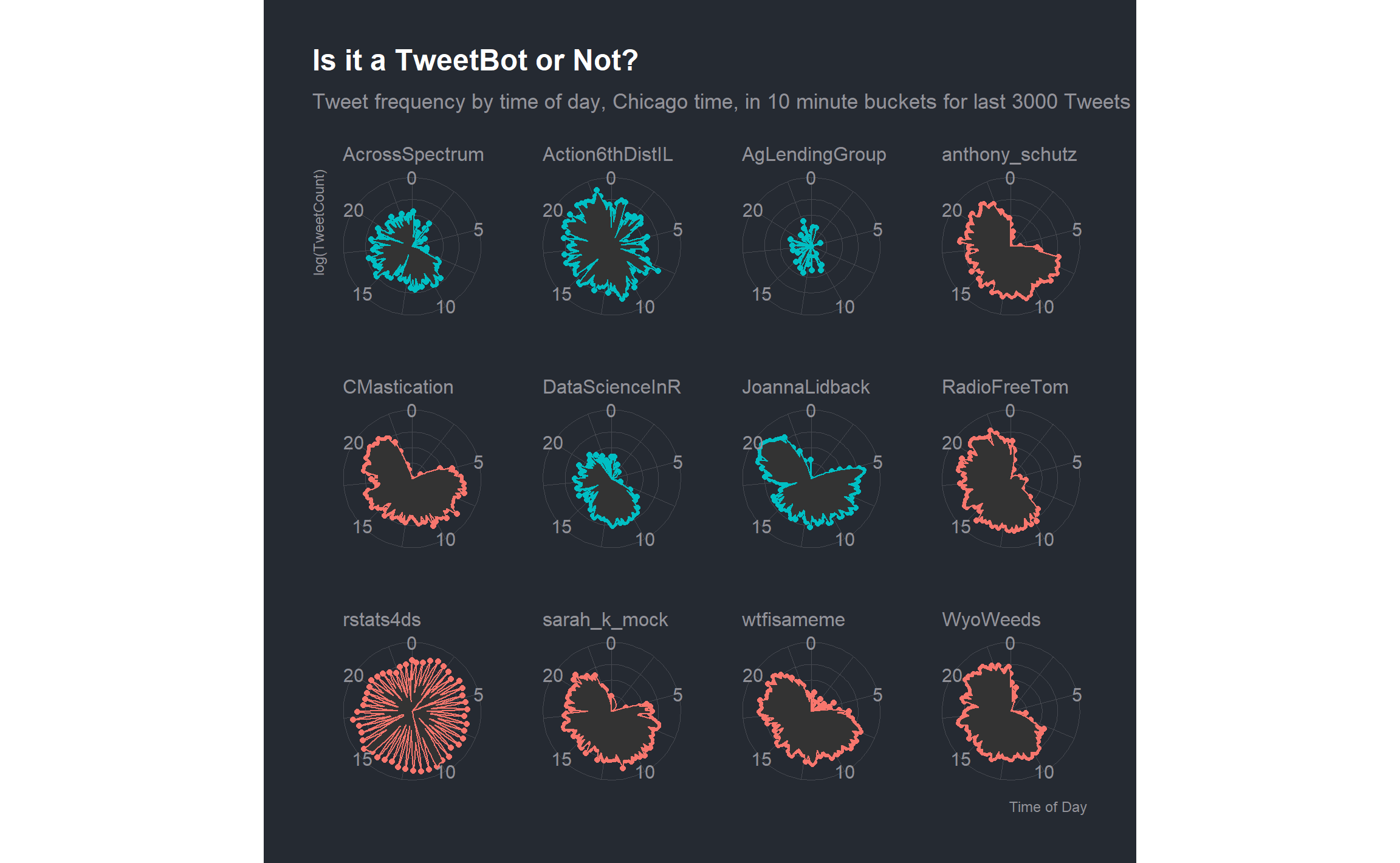
To gather the remaining details of my follower’s connections, we will have to call get_friends() for each of my followers. Twitter has a rate limit. That is, the base API allows 15 requests in a 15 minute period, so the commands are written to pause when it runs out until it can make more requests. With the size of my followers friends lists I expect the process to take around 70 hours, so saving *.csv files is a strategy for restarting if and when problems arise. (Where possible, source this code from a cloud based virtual machine that you can walk away from for a couple of days.)
allfriends <- function(target_account){
  friendable <- rate_limit("get_friends")
  if (friendable$remaining[1] < 1) {
  Sys.sleep(as.numeric(difftime(friendable$reset_at[1], Sys.time(), units = "secs")) + 2)
  }
  result <- tryCatch(get_friends(target_account, retryonratelimit = TRUE),
                   error = function(e) NULL, warning = function(w) NULL)
  if (!is.null(result)) {
  write_as_csv(result, file_name = here("content/post/rtweet-on-windows/fr/",target_account,"FR.csv"))
  }
}

still_to_get <- top_usrs$user_id

lapply(still_to_get, allfriends)
To restart the process, ignoring already downloaded follower ID’s, we would execute this code:
still_to_get <- top_usrs$user_id[!(top_usrs$user_id %in% gsub("FR.csv","",list.files(path = here("content/post/rtweet-on-windows/fr/"), pattern="FR\\.csv"), fixed = TRUE))]

lapply(still_to_get, allfriends)
There may well still be friends lists we can’t get, like private accounts, so we are working only with the publicly available information.
Some while later… 63 hours for me, in fact, …we read in all the saved csv files and compile them into one list.
df_relationships <- map_dfr(list.files(path = here("content/post/rtweet-on-windows/fr/"),
                                       pattern = "FR\\.csv$",
                                       full.names = TRUE), read_csv, col_types = "cc") %>%
  select(user, user_id)
df_relationships %>%
group_by(user_id) %>%
mutate(occurances = n()) %>%
ungroup() %>%
count(user) %>%
summarise(entries = sum(n), uniques = n())## # A tibble: 1 x 2
## entries uniques
## <int> <int>
## 1 3559934 1751The dataset then represents 3,559,934 relationship pairs for the 1751 (public) top active accounts following @jim_gruman.
Because our interest is in finding commonalities in who follows the same accounts, let’s check how large the problem would be if we remove the accounts only followed by 1 person in this dataset, as unique accounts, by definition, are not shared with other people.
df_relationships %>%
  group_by(user_id) %>%
  mutate(occurances = n()) %>%
  ungroup() %>%
  filter(occurances > 1) %>%
  count(user) %>%
  summarise(entries = sum(n), uniques = n())
## # A tibble: 1 x 2
## entries uniques
## <int> <int>
## 1 2725818 1751This simplifies the problem to 2,725,818 relationship pairs, without losing anything that we care about in this analysis. Let’s then turn it from a long list of individual pairs to a wide list of one row for each person that follows me and a column for each account followed by any (2 or more) of my followers.
To apply TSNE or UMAP affinity mapping, the data frame needs to be reshaped into a wide matrix. Given enough time, I would have investigated the sparseMatrix data structure as well.
wide_relationships <- df_relationships %>%
  group_by(user_id) %>%
  mutate(occurences = n()) %>%
  ungroup() %>%
  filter(occurences > 1) %>%
  select(-occurences) %>%
  mutate(weight = 1L) %>%
  pivot_wider(names_from = user_id,
              values_from = weight,
              values_fill = 0L)

dim(wide_relationships)
## [1] 1751 318419With 1751 rows and 318419 columns, where there is a 1 if a person follows the account and a 0 if they do not, we will use dimension reduction techniques to reduce the data frame down to 2 columns for an x and y position to plot. For brevity, will apply the UMAP technique here.
data_matrix <- as.matrix(wide_relationships[,2:ncol(wide_relationships)])For building the UMAP reduction, please note that I used an hp Omen Windows laptop with 16 GB of RAM and a 2.2 GHz i7 processor. It took several minutes, towards the end of which the cooling fans were audibly active.
friends.umap <- umap(data_matrix)
umap <- as.data.frame(friends.umap$layout)

umap$user <- wide_relationships$user
Let’s also explore the amount of cross-following, that is, accounts that follow both me and accounts that follow me, as this has implications in characterizing the spread of information through my social network and the extent of the bubble. If we treat cross-followed accounts as major cites on a map, we need to rank the accounts by how cross-followed they are among those on the list.
prominence <- df_relationships %>%
  count(user_id) %>%
  mutate(user_id = str_remove(user_id, "^x"))

landmarks <- top_usrs %>%
  left_join(prominence, by = "user_id") %>%
  select(user = user_id, screen_name, follows = n) %>%
  mutate(follows = ifelse(is.na(follows), 0, follows))

write_rds(landmarks, file = here("content/post/rtweet-on-windows/landmarks.rds"))
From here it is a visualization exercise with labels supplied by the landmarks. Let’s see what happens when all of the labels for handles with follows greater than 240 are turned on.
umap %>%
  inner_join(landmarks, by = "user") %>%
  mutate(screen_name = ifelse(follows > 240,
                            screen_name, NA)) %>%
  ggplot(aes(V1,V2,size = follows, color = follows)) +
  geom_point(show.legend = FALSE) +
  labs(title = "Twitter Social Media Following", subtitle = "UMAP",
       caption = paste0(format(Sys.Date(), "%b %d, %Y"), " @jim_gruman")) +
  geom_label_repel(aes(label = screen_name), size = 3, color = "black") +
  scale_fill_gradientn(colors = pal,
                       aesthetics = c("color","fill"))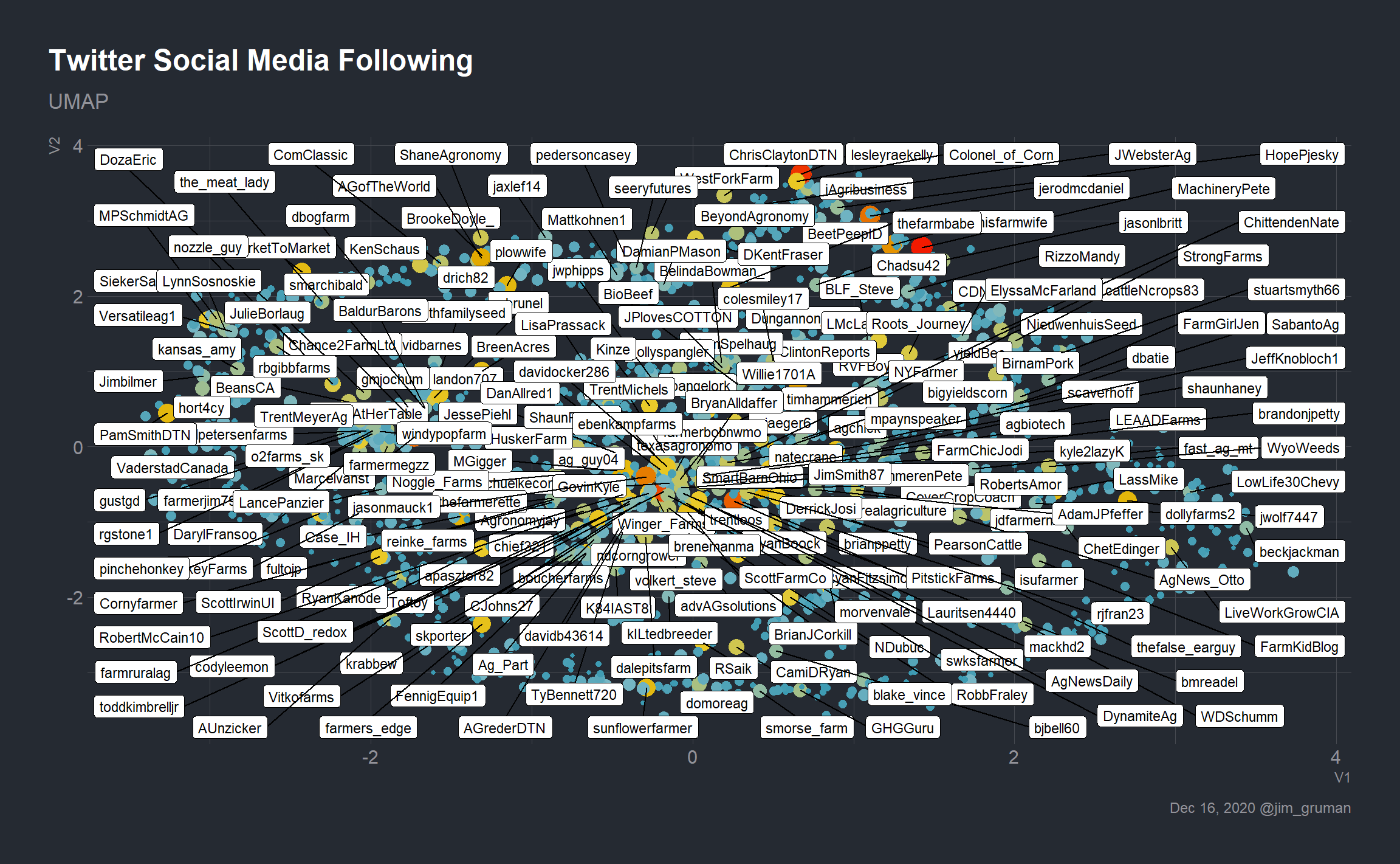
We can do better.
Let’s take a closer look at the position of a bunch of #AgTwitter and #Rstats accounts, to explore how natural the groups seem to be.
ag <- c("MachineryPete","lesleyraekelly","apasztor82",
        "PitstickFarms", "farmermegzz", "jerodmcdaniel",
        "jasonmauck1", "thisfarmwife", "MGigger",
        "jwolf7447","plowwife","ag_guy04","sunflowerfarmer",
        "allison_horst", "CMastication")

umap %>%
  inner_join(landmarks, by = "user") %>%
  mutate(screen_name = ifelse(screen_name %in% ag,
                            screen_name, NA)) %>%
  ggplot(aes(V1,V2,size = follows, color = follows)) +
  geom_point(show.legend = FALSE) +
  labs(title = "My Twitter Social Media Following", subtitle = "UMAP",
       caption = paste0(format(Sys.Date(), "%b %d, %Y"), " @jim_gruman")) +
  scale_fill_gradientn(colors = pal,
                       aesthetics = c("color")) +
geom_label_repel(aes(label = screen_name), size = 6, color = "black") 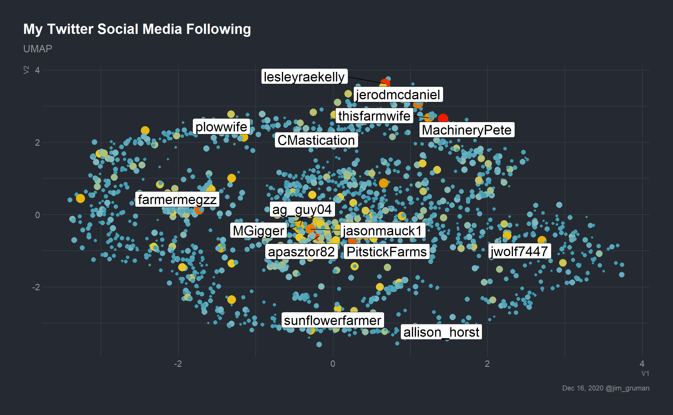
There may be clustering structure in the cloud, but the image is very busy. How much more effective could a visual using density hexbins be?
umap %>%
  inner_join(landmarks, by = "user") %>%
  ggplot(aes(V1,V2)) +
  geom_hex(color = NA) +
  scale_fill_gradientn(colors = pal,
                       aesthetics = c("color","fill"))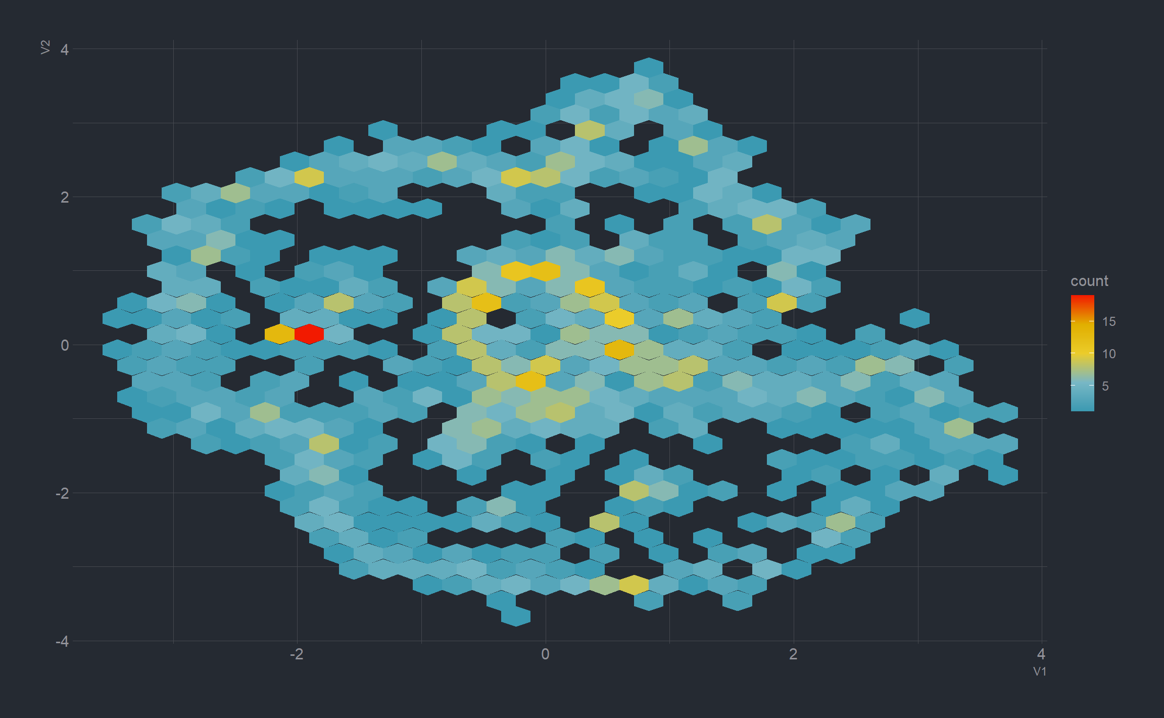
The pangea-like quality is visually appealing. Let’s see what can be done with labels or annotations, and a follower count greater than 400.
umap %>%
inner_join(landmarks, by = "user") %>%
mutate(screen_name = ifelse(follows > 400, screen_name, NA_character_),
xpoint = ifelse(follows > 400, V1, NA),
ypoint = ifelse(follows > 400, V2, NA),
) %>%
ggplot(aes(x = V1,y = V2)) +
geom_hex(color = NA, show.legend = FALSE) +
scale_fill_gradientn(colors = pal,
aesthetics = c("color","fill")) +
geom_point(aes(xpoint, ypoint)) +
geom_label_repel(aes(label = screen_name),
size = 3,
label.padding = 0.25,
box.padding = 2.5) +
labs(title = "Where my tweets travel",
caption = paste0(format(Sys.Date(), "%b %d, %Y"), "| @jim_gruman")) 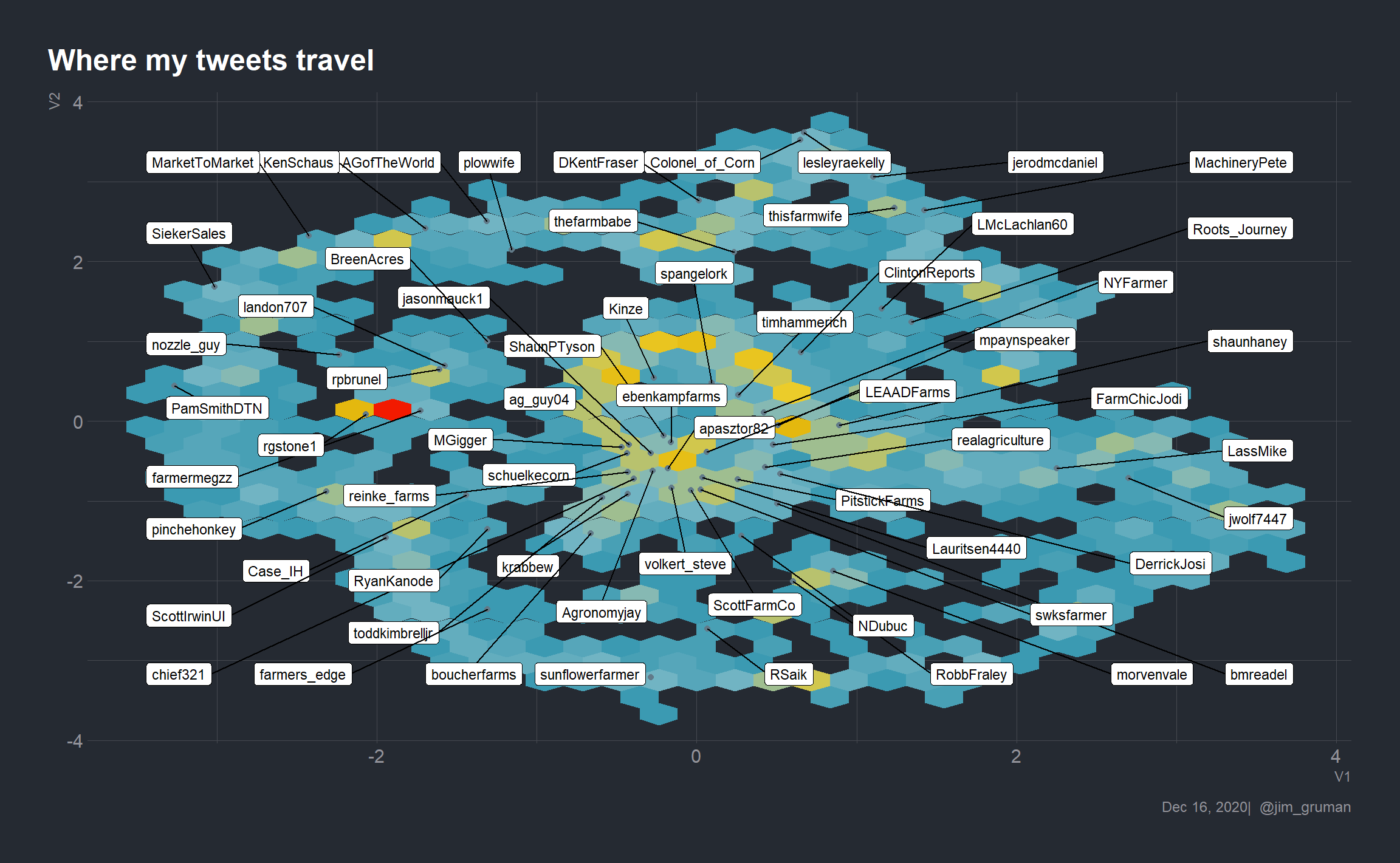 Even with the box.padding parameter, it is a challenge to achieve the right balance of labels and visual. Let’s selectively add in accounts that we think are illustrative, as a personal choice.
cities <- c("allison_horst", "CMastication", "wtfisameme", "Casein_Micelles", "AgNews_Otto",  "SteveSprieser", "hoffsbeefs", "eatcookwrite", "ChrisClaytonDTN", "jerodmcdaniel","agronomistag", "timhammerich", "farmermegzz", "AGofTheWorld", "RobbFraley")

umap %>%
  inner_join(landmarks, by = "user") %>%
  mutate(screen_name = if_else(screen_name %in% cities, screen_name, NA_character_),
         cityx = ifelse(screen_name %in% cities, V1, NA)) %>%
  ggplot(aes(V1,V2)) +
  geom_hex(color = NA, show.legend = FALSE) +
  scale_fill_gradientn(colors = pal,
                       aesthetics = c("color","fill")) +
  geom_point(aes(cityx, V2, size = follows), show.legend = FALSE) +
  scale_size_area(max_size = 2) +
  labs(title = "Where my tweets travel",
       caption = paste0(format(Sys.Date(), "%b %d, %Y"), " @jim_gruman")) +
geom_label_repel(aes(label = screen_name), size = 6) 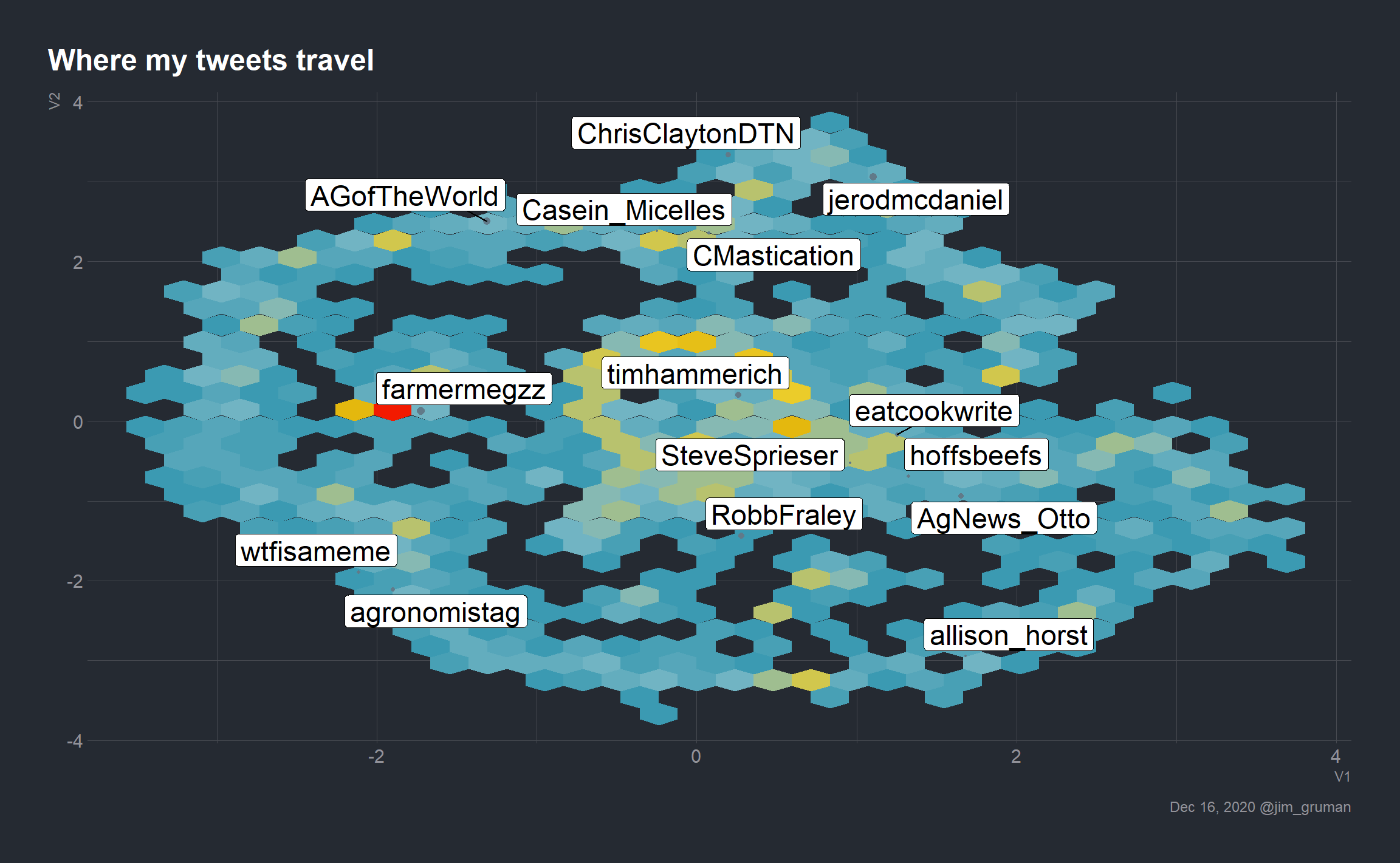
References
Kearney MW (2019). “rtweet: Collecting and analyzing Twitter data.” Journal of Open Source Software, 4(42), 1829. doi: 10.21105/joss.01829, R package version 0.7.0, https://joss.theoj.org/papers/10.21105/joss.01829.
tweetbotornotpackage